Ruby wedding anniversary
Hi there!
I was creating these cards with some breaks for three weeks... THREE WEEKS! After my August illness, I had so many delays that unfortunately my passion had a moment to breathe from me. In addition, my car died, so I had to urgently deal with the disposal of the old one and the purchase of a new car. Whoever changed the car urgently knows what I'm writing about... Without my husband's help, I'd have had a mental breakdown. This is not a joke. So I sat down to fulfil these two orders in my spare time. Fortunately, both orders were without deadline and both ones were for the 40th wedding anniversary. In my case, two similar works are created much faster than two completely different ones. How is it with you? Wait... - these cards are not the same, they differ significantly, I used similar accessories, the same colour palette, but the compositions are completely different.
Since I've already mentioned the color palette, I will also mention another great happiness: it's so wonderful that such colors appeared in the October moodboard challenge on the Dusty Attic blog. Maybe you too will take up this challenge? All you have to do is add your art work to the comments section of the Dusty FANattics Facebook group for a chance to win one of two amazing prizes of $50 (AUD) on purchases from their store. I can't wait to see your work on the Dusty FANAttics group.
Card base is beige, the edges are frayed and stained with "Vintage photo" Distress. My brand of scrapbooking papers Margaret Paper Design was established relatively recently and we still do not have a Design Team, so I'm doing my best to show you its possibilities on my own art works. This time I used two sheets from the "Breeze Of Dreams" collection with a tiny ruby flowers: 8A and 8B. I cut the papers a bit smaller than the base of the page, because I wanted a ruby border to form around it - for this purpose I cut the white paper and dyed the edges with Ruby ColorBox ink. The color is wonderful, exactly what I needed, but unfortunately the ink pad completely deformed after this one project. The ink on the paper dried for almost three days... this is another disadvantage that should be considered before buying. I have a lot of other shades of this brand and there were no such problems before, so I either hit the wrong item or this particular color has such a disadvantage. I decided to custom, fancy sewing on the edges with a beige thread.
Then I took a Creative Script mask with a fantastic text about simplicity, ending with the words: never stop creating. Do you sometimes read these inscriptions on stamps, masks and papers? ;) I didn't focus on the symbolism of the text before; it was supposed to be nice, atmospheric and that's it. But the first time I had to choose a text for a paper graphic, I realized that these texts mean something and are often inspiring. Recently, I chose the same mask as part of the DT package, but in the size of 12 'x 12', you will certainly see it in action with LO. I used a matte paste from Ranger and left such a white colour as I wanted this inscription to come out from under the composition very gently but not to distract from what is important.
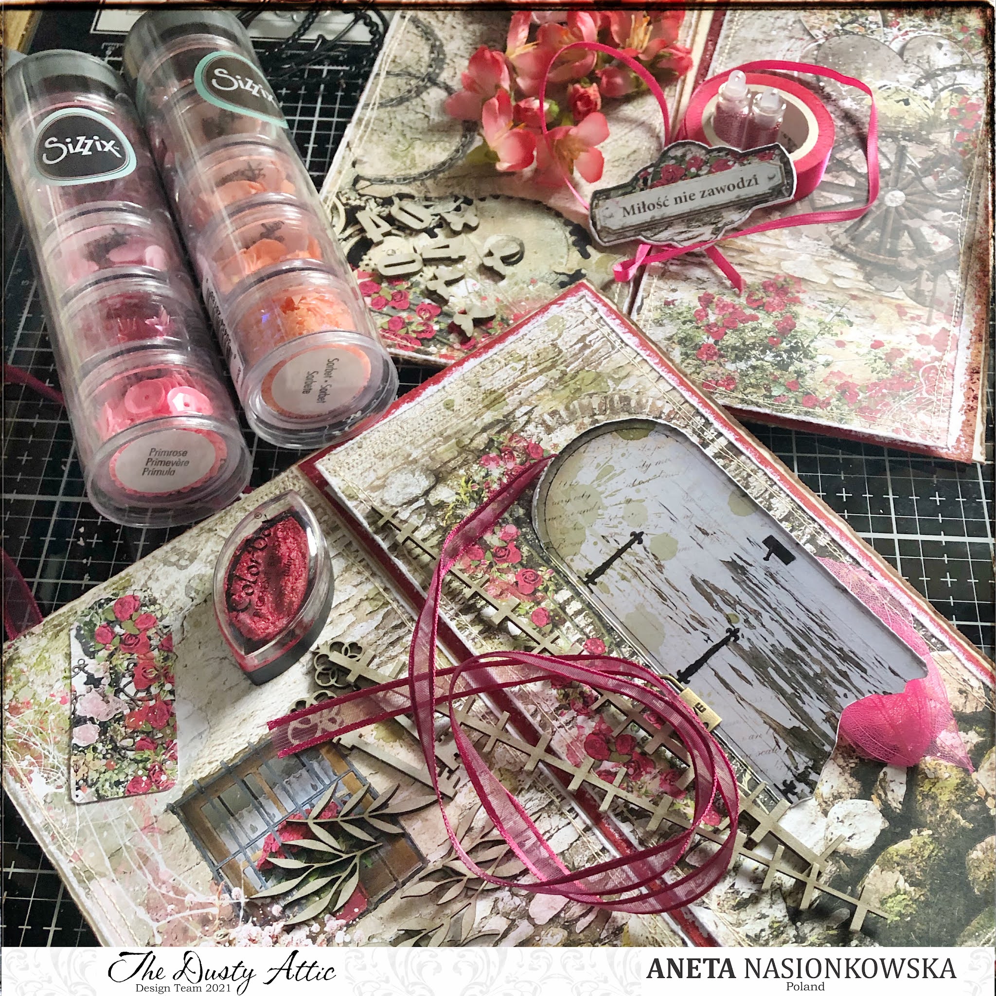
Card with door took me a little longer. I decided it would be more interesting when this door remains open and I invent something inside. I did what I thought: I decorated the interior with layers of paper, put there loads of small beads, applied a mask, even a piece of decorative lace. And then, I created such an impressive flower arrangement on this door that it finally turned out that it didn't want to open fully, and at most it is half-open. And what?! Nothing. It still looks great, and if someone takes the trouble to rummage in this crevice, they'll see my secret world. Sometimes it is so that what turns out to be a great plan in your head turns out to be a less great plan in life. Fortunately, I recorded this stage of work so if I find a moment, I will save the mysterious contents of the ajar door on my IG profile.
I will now describe the main composition: at the bottom there is a crumpled white gauze and a curled bright pink sisal - quite a lot. As always, all cardboards are secured with a white gesso. I cut one length from the cardboard panel, colored the mini leaves with Indian Pink wax from Finnabair and Christmas Red water paint from Cosmic Shimmer. I did the same for the decorative keys and the number 40. Two pieces of plastic film from Tim Holtz stick out from under the flowers. This time the flowers are bought: there is a ready-made bunch of paper flowers - these are the vivid pink ones; fabric - those falling into the shade of apricot-coral and tiny white clogging holes from Tim Holtz. It is complemented by two bows, one in a pale pink shade of lace, the other of a ribbon falling into a burgundy color.
One of the cards has a large heart cut with a die in three different sizes from three different papers which I stick with a distance. The largest of them is decorated with the effect of cold embossing, thanks to the 3D embossing folder from Sizzix. The bottom part of the front page is covered with cute banners with tiny ruby flowers cut from the cutting sheet on the other side of the paper pad cover. One has a sign "Love knows no bounds", the other has a blank sign with the words "40 years have passed as one day". I could end this post like this, but it will not happen, not yet. :D
TAKE CARE OF THE DETAILS
Today I'd like to draw your attention to the huge role played by details. If you want your work to be extraordinary and impressive - take care of the details. On the example of these cards, I will show what I mean:
- under the composition, before gluing the flowers, I scattered small dark pink beads on the glue. Such a thing immediately causes the recipient to think: what an elaborate job!
- in some places I applied a delicate layer of paste with a cracking effect, waited for it to dry and tinted with a matching paint,
- I made white dots with Nuvo drops on the corners of the card and on the signboards. One in the picture is damaged - I corrected it later :)
- you can see small apricot hearts from Sizzix: around the bottom banner, on the lace bow and just above the flowers,
- on both cards there are two mini butterflies in pastel-coral colour, thanks to the drops from Dovecraft,
- throughout the entire creative process, I took care of the 3D effect of glued following layers, which gave the work space, and this is an advantage in our profession! - well... unless you're making a card to an envelope... :)
- the last but not least was splashing the entire work with white paint dots.
The only limit is our imagination. These are just examples that I used in this particular case. I encourage you to spend a moment longer on the details and the effect will be surprising. I hope you found this post interesting. Let me know in the comment, if such advice is something interesting or boring. Best regards and see you next time!
Products used this time:
Dusty Attic's products:
Margaret Paper Design's products:
Thank you for being with me here and best regards!
If you want to receive notifications about a new blog entry - click subscription: *


Komentarze
Prześlij komentarz